FOALS / HOLY FIRE 2011
For my back cover, I was majorly influenced by Foals. This is because, looking at a typical Indie digipak, they are typically simplistic as well as having it effective in order to appeal most of your audience into purchasing the package. Therefore, I have applied my own design and synergy to my Digipak.
Wednesday, 8 March 2017
Influential Album Covers (2)
BORN TO DIE / 2012
Lana Del Rey's 'Born To Die' album cover includes a mid shot of herself in front of the cover; which shows that she has a certain star image and it is similar throughout her other album covers. The way she is presented in the front cover is vintage like which could attract a mass of audience who are most likely into vintage styled music.
Solo artists tend to feature on their album cover compared to indie bands. This is because solo indie artists are the center of attention when marketing their music and the album is intentionally about them only. This has inspired me to create a Digipak where I will be including the solo artist in the front of the cover to show star image and that it mainly focuses on the artist herself.
Lana Del Rey's 'Born To Die' album cover includes a mid shot of herself in front of the cover; which shows that she has a certain star image and it is similar throughout her other album covers. The way she is presented in the front cover is vintage like which could attract a mass of audience who are most likely into vintage styled music.
Solo artists tend to feature on their album cover compared to indie bands. This is because solo indie artists are the center of attention when marketing their music and the album is intentionally about them only. This has inspired me to create a Digipak where I will be including the solo artist in the front of the cover to show star image and that it mainly focuses on the artist herself.
Influential Album Covers (1)
THE LUMINEERS / 2012
When designing my Digipak, I explored a wide range of designs for the front cover and this includes The Lumineers' layout. It is showing us a woman and a little girl in right next to a very old house. I mainly focused on the way the front cover is laid out such as the font/title on top of the image and the imagery being in the center along with a white border around the image. This album cover inspired me in order to apply the design on my own Digipak as it is unique and its simplicity have captured my attention.
THE VACCINES / 2011
The layout of The Lumineers and The Vaccines are fairly similar to one another as oppose to the colours of the text and the box in the center behind the image.
Tuesday, 7 March 2017
Digipak Progression (1)
Thursday, 2 March 2017
Inspirations //
1ST MUSIC VIDEO - LANA DEL REY (PROJECTION SCENE)
We were inspired by a scene in Lana Del Rey's music video "Summer Time Sadness" where she stands by a projector and it projects telephone wires. It illustrates an idea of uniqueness to the music video. Applying this to our music video, we decided to project a moving image of trees to show the inner emotion of the artist - she fixes her hair and lowers her head to create a sympathetic movement which matches with the projected moving image.
2ND MUSIC VIDEO - ADELE (GLITCH)
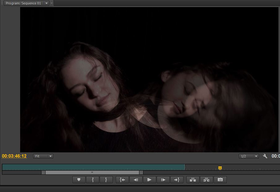
Watching Adele's music video "Send My Love" we took a glimpse of a particular scene where Adele is in the center of the studio, singing while different shots of her singing are appearing but in an faded, overlapping way. Taking inspiration, we decided to include a similar technique by overlapping scenes of the artist wandering her head around. This represents different emotions moving around- at the peak of exploding.
Website inspirations // Research
While designing my own website, I did a few research on well known artists with websites which had inspired me such as the aesthetics of the website, colour, layout and
Troye Sivan's merchandise website were one of my inspirations when building my merchandise page/website. The layout of the website is not too complicated since the navigation is clearly shown on the top of the website, and the products are already shown in the front. The audience will likely to return to the site as it is accessible.
I was inspired by the colours on Ariana Grande's website. I like the softness of the pink which I applied onto my own website. As well as using baby pink, I also used a combination of white and black to match the palette. This allowed me to make a theme to the package that I am producing.
With Lana Del Rey's website, the layout is what inspired me the most when I went through her website. The title in the middle of the web page gives the audience an idea of what the artist has produced recently and to be able to catch up with the artist's music.
Lastly, The xx's tour page was one of an inspirations when building my Tour page for my own website. I like the use of their font and layout to present simplicity to the page- it's not too bold and bright but it's not too basic either. I adapted an idea and included it to my website.
Troye Sivan's merchandise website were one of my inspirations when building my merchandise page/website. The layout of the website is not too complicated since the navigation is clearly shown on the top of the website, and the products are already shown in the front. The audience will likely to return to the site as it is accessible.
I was inspired by the colours on Ariana Grande's website. I like the softness of the pink which I applied onto my own website. As well as using baby pink, I also used a combination of white and black to match the palette. This allowed me to make a theme to the package that I am producing.
With Lana Del Rey's website, the layout is what inspired me the most when I went through her website. The title in the middle of the web page gives the audience an idea of what the artist has produced recently and to be able to catch up with the artist's music.
Lastly, The xx's tour page was one of an inspirations when building my Tour page for my own website. I like the use of their font and layout to present simplicity to the page- it's not too bold and bright but it's not too basic either. I adapted an idea and included it to my website.
Merchandise (What to include)
Subscribe to:
Posts (Atom)